In the ever-expanding world of cloud computing, data has become the lifeblood of organizations. The...
Pushing FinOps data to the edges of your organization with department scorecards
How do you evaluate your FinOps performance? How do you know if your cloud teams are doing their job? Do you know how you perform against your competitors? How do you empower and motivate your team to improve cloud efficiency?
In this blog post, I will tell you how to accomplish both: evaluate how your FinOps team is doing and how to motivate action for improvement. The answer is by democratizing FinOps data. But how you deliver the data matters. We tell the virtues of a department-level scorecard and give some thoughts on how to make them effective.
The case for democratization
For most organizations, the need to optimize the cloud is no longer optional. Business has become increasingly dependent on the cloud and that reliance is only accelerating thanks to the rush to AI/ML.
To optimize and manage the cloud, many of the companies we work with follow (at least to some extent) the best practices as established by the FinOps Foundation. Regardless of their commitment to FinOps methodologies, we find in practice that they tend to adhere to the principles of centralized rate reduction and decentralized usage reduction.
Most large companies have a centralized FinOps team often using CloudHealth or Cloudabilty and have honed their commitment discount purchase strategy -- for the most part. They have a manageable cost allocation process -- albeit often manual and not timely. They are talking about how much better their forecasting process would be if they had unit economics in place. And they are all struggling to empower their engineering teams to “take action.”
Empowering engineers to take action
How to empower and encourage engineering teams to take action is a chief concern for companies. Over the past few years, it has been identified as a top issue in the FinOps Foundation’s annual State of FinOps report.
Many companies have tried to take engineers out of the equation by automating remediation. This strategy seems like a great idea until the support calls start coming because the recommendation algorithm downsized a resource without awareness of a key metric. Kate Ferguson’s (Liberty Mutual Insurance) excellent FinOps X 2023 session on reporting further discusses some of the challenges of empowering engineers and other personas. Links can be found at the end of this blog post.
How do you empower, motivate, and incentivize engineers to act? While there are several factors in play, ranging from visibility to having a culture of accountability, for this post, we are going to focus on democratizing FinOps data. More specifically, providing visibility at the department level. Ensuring that stakeholders have access to timely, relevant data including benchmarks that quickly identify opportunities for a team.
Enter the department-level scorecard
A well-designed scorecard plays a pivotal role in driving cloud optimization. It illuminates both the opportunities and inefficiencies within cloud usage. It’s tailored to a department or team and answers the question, “How is my department or team performing?” The scorecard should be constructed with measures that are aligned with the organization's objectives. It allows drill through to the details behind a metric or recommendation.
The efficiency score for benchmarking and accountability
We recommend a balanced scorecard approach with several key metrics based on optimizations that the team can control. But there is one top-level metric that stands out above them all. We call it the efficiency score. It is a single measure that can be used to benchmark across your teams as well as externally. It is industry-agnostic, spend-agnostic, architecture-agnostic, and cloud-agnostic.
The efficiency score is defined as: 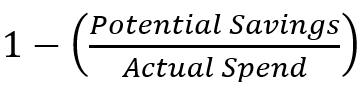
which can be expressed as a percentage or number.
Ironically, efficiency score percentages loosely align with academic letter grades. At 95% optimized, you’re doing a great job, 75% needs immediate improvement. Potential savings should be isolated to actions under the control of the team. For example, an engineering team should be held accountable for rightsizing actions, not (centralized) commitment discount purchases.
Prioritize opportunities: the Pareto Principle
The efficiency score is an excellent way to assess the overall health of a FinOps team down through to the department. It starts to lose value as you get closer to the individual resource level. A 78% score at the department level indicates some serious room for improvement.
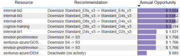 But if one is looking at the individual resource level, is 78% good or bad? Obviously, there’s room for improvement, but a better question is, should I be spending time optimizing that resource? It’s difficult to tell unless you dollarize the opportunities and rank them in a Pareto chart or similar.
To further make the point, a 78% optimized resource has a 22% improvement opportunity, if the monthly spend is $100, the savings potential is $22/month. Unless your organization is operating at a “Run” level of maturity across all FinOps domains, you likely have bigger opportunities elsewhere.
Seeing red: the use of color to elicit a response
Most people have little connection to seeing raw numbers on a spreadsheet and being asked to optimize or reduce their cloud spend. The well-designed scorecard tells a story, it brings numbers to life. That story is told through KPIs, illustrations, thoughtful layout, and the use of color.
In business, we are conditioned to interpret green as good while red is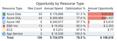 usually reserved for bad. Want to ensure that a KPI on a scorecard gets attention? Change the font to red and it will likely get noticed. Is the KPI really important? Use red in a graphic such as a bar chart or doughnut chart. No one wants a red graphic on a scorecard that will be seen by their management team or peers. The downside is if you put that $22/month opportunity in red on a scorecard, it will get attention and it will be optimized, potentially at the expense of something with a higher return.
Make it a competition
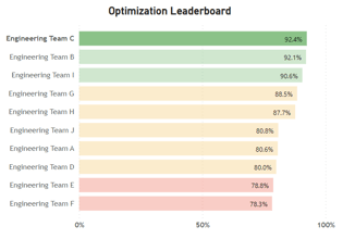 Gamification is all the rage in business apps these days. What people often think of when I bring up gamification are things like the confetti that explodes on your phone when you text someone “Happy Birthday.” Robinhood’s trading site displayed confetti when you completed a trade such as buying a stock option (the feature was removed after legal action). I’m not sure what it would display if you lost money.
We’re all about pragmatic gamification, the use of leaderboards, progress bars, and achievement levels. All these indicators are easy to implement in a scorecard and when shared across engineering teams can create a healthy level of competition.
Carbon tracking
I get into a lot of discussions about the cloud and sustainability as a member of the FinOps Foundation’s Sustainability Special Interest Group and with clients and prospects. Companies that have started cloud carbon tracking and illustrate potential carbon savings find that the carbon metric drives change faster than any other single metric.
While many stakeholders feel disconnected from cost savings opportunities, most feel a deep connection with reducing their company’s carbon footprint. They will quickly take action when presented with a carbon emission reduction opportunity. Getting consistent cloud emission data for carbon calculations is still somewhat challenging. Several startups are working to solve this problem and their data can be incorporated into a scorecard.
Ease of access
It is important to be thoughtful about how you deliver scorecards. Most organizations I speak with are trying to democratize reporting using self-service tools such as Power BI or Tableau. Bringing in a new tool can be met with resistance and user adoption challenges. If your company has a reporting tool standard, the decision has been made for you. If you are on the hunt for a tool, I like Power BI because it can be deployed as a stand-alone application, or it can be embedded into a web portal or other applications that are in widespread use. If you expect people to use the scorecards, they need to be ingrained in your corporate culture and easily accessible.
Building a department-level scorecard
Giving FinOps and IT teams access to the metrics they can control helps to provide motivation and a sense of accountability. A department-level scorecard is an excellent vehicle for democratizing access to FinOps data empowering engineers to take action.
Developing and deploying a well-designed department-level scorecard requires FinOps domain expertise and experience in scorecard development. If you're starting from scratch, the process can be lengthy. If you start with a well-developed FOCUS-ready semantic data model, you can build an MVP in hours.
The Envisor platform is FOCUS-ready and is purpose-built to deliver customized, robust cloud cost optimization analytics. We can build and deliver executive dashboards and scorecards that pull together and harmonize KPIs across clouds, applications and divisions to optimize your cloud. Contact us to learn more.
Stay tuned for our upcoming blog posts on unit economics and cost allocations where we skip the well-covered discussion on blended vs. unblended rates and dive into complex allocation topics such as shared resources, the annual reorg M&A, and more.
Resource links
Putting Reporting in the Path of Different Personas - Kate Ferguson - Liberty Mutual Insurance - Watch on YouTube here
FinOps as a Product - Kim Wier & Ron Tatro - Target Corporation - Watch on YouTube here
Building Internal Custom FinOps KPI Scorecards - Noel Crowley - Fidelity - Watch on YouTube here